For The Love of Hanson | Home Tour
Jess and Chris Hanson are in my mind, a fountain of humble creativity, who repeatedly breathe life into their home no matter the size or layout. I've been fortunate enough to journey with them in their several moves around Seattle over the last few years and their most recent home has had a particularly great effect on me.
I think it has partly to do with the tiny home phenomenon that has become so prevalent recently. I've been hooked on watching several of the HGTV shows that chronicle the lives of couples ready to discard the 2,000 sq ft lifestyle in pursuit of something completely streamlined. The decision to live by the bare necessities, but still desire a rich and uniquely designed home, is an admirable choice that can cultivate a beautiful space. In the case of Chris and Jess, the impression of comfort and simplicity is bountiful, and enlivened through the use of bold prints and interesting textures.
Their newest home is in their parent's basement in Bellevue, WA. A 400 sq ft renovated studio that in its bare bones seems a tad intimidating for its small size and restrictive space, especially with a newborn baby (a precious girl named Penelope), but that wasn't an intimidation that held them back. It was certainly a process; when I spoke with them they told me that the initial big picture was to live there in transition, to make it rent-able for the next tenant, but not invest too much energy or money into it as they would have in their previous homes. The space was a great platform to help them pursue their other goals, financially it was great, but initially design was not part of the plan.
Yet as they cleaned and redid the necessary repairs, what was once intended as suitable fixes turned into creating a home that reflected their warmth and creativity.
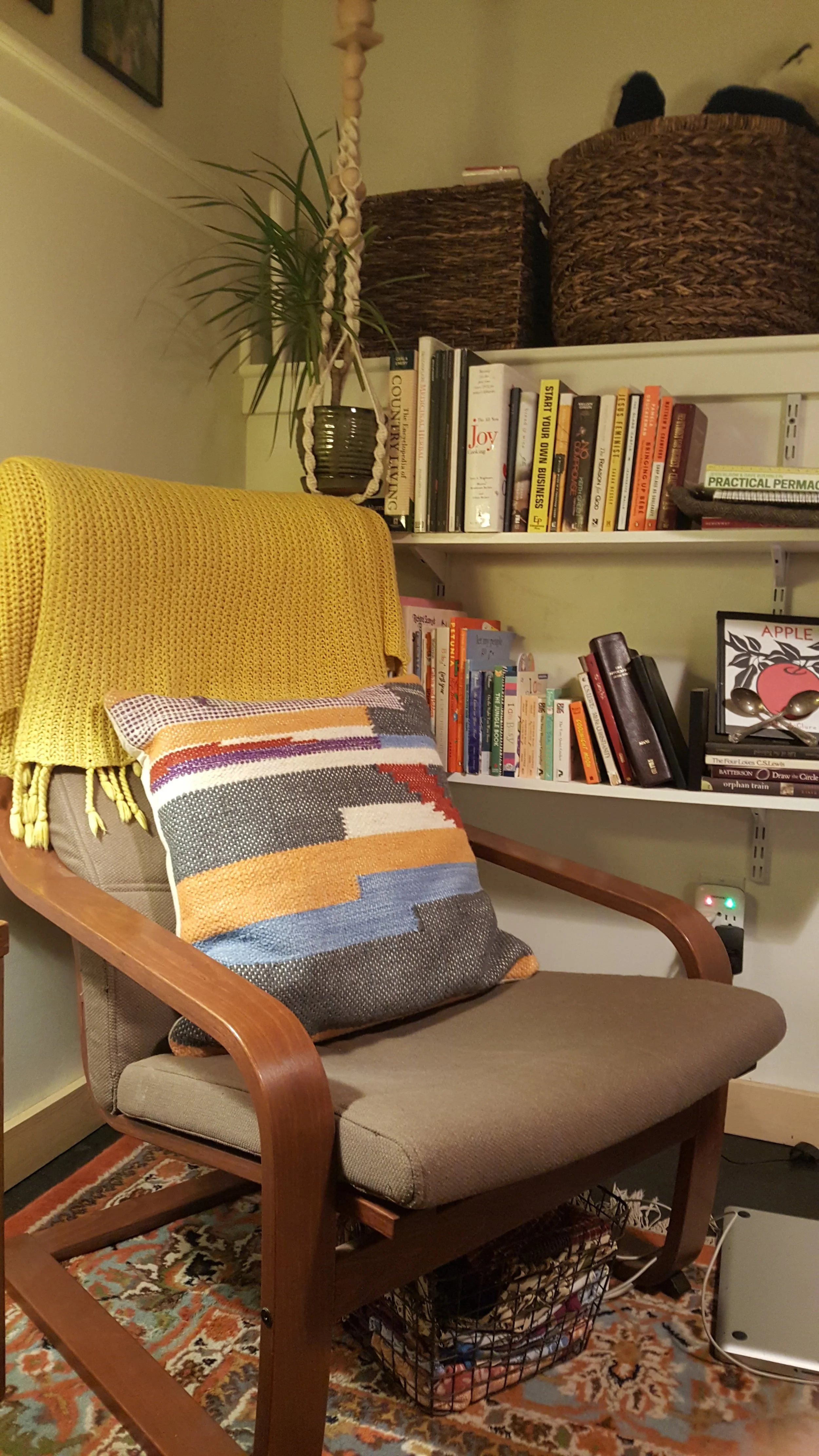
Some of the design elements that make the space so interesting are the monochromatic backdrop with crisp white walls and a starkly contrasted matte black concrete floor. In the past Jess and Chris have used a lot of both dark and vivid colors, forest greens and burnt oranges, but in the case of this studio they wanted to try to simplify their style a bit. Painting the walls and kitchen cabinetry white provided a "clean slate" and adding natural wood accents in the baseboards, shelving, and furniture kept the design from feeling too sterile.
The floor, one of my favorite features, was a decision that created some reserved reactions. There was a slight concern that the black paint would be aesthetically too cold, but it truly has created the opposite effect. It is bold and graphic, brings an impact to the space and is a perfect back drop to the beautiful patterned Turkish rug. Those colors, forest greens and burnt oranges, are still prevalent throughout their home in the accents of their furniture and art and overall feels cohesive and comfortable.
Hello George...
Sometimes it is difficult to imagine living in such a small space, and they mentioned some challenges, but also brilliant ways to make it work. Here are some we talked about...
Things get dirty, rather quickly.
You would think that maintaining a home with such small square footage would be easier, considering less space means less time to cover all the ground. And there is still truth to that, but then again you are treading upon the same floor, dropping food in the same spot, and when clutter forms in one corner of the room it feels much like it's taking over the whole house because that room is essentially the living, dining, hallway, kitchen...the whole house. But at the end of the day the short time spent to clean up any mess is hard to beat compared to a typical multi room home.
Get creative with storage.
Above their dining table they installed wood shelves with awesome stainless steel brackets to house their food and hang cups along the bottom. Along the adjacent wall is a white pegboard that they used to hang their utensils and cutlery. Customization is key to making a space of this size fit ones needs. Rather than feeling limited by the restrictions, they were able to create the organization they needed by building pieces to fit the to the parameters of the space. This subsequently made the space seem more flexible.
Let each piece serve more than one purpose and make the most of the space you've got.
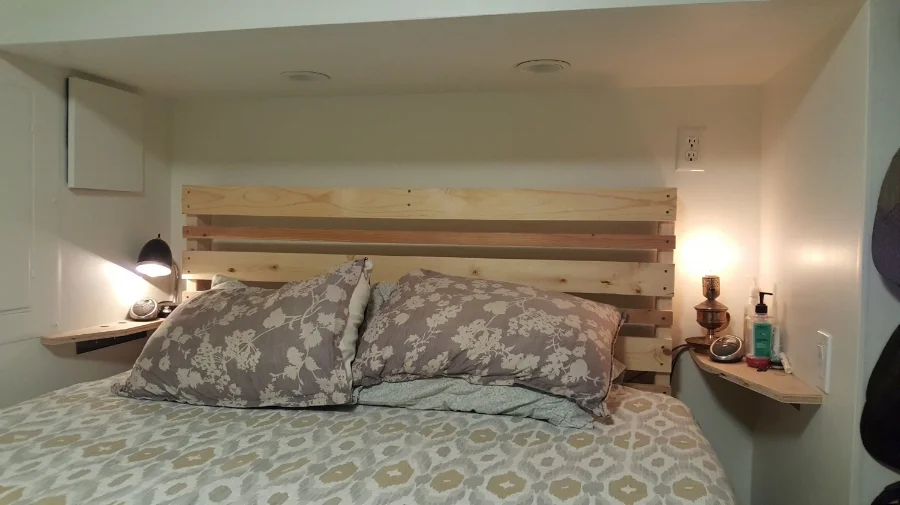
Chris created a bed frame that allowed for storage underneath using the same pine wood as is used in other parts of the home. Where the bed is tucked into a little alcove little shelves were added (crafted also by Chris) for storage on either side of the bed. It was implementing space vertically and horizontally, high and low, to get as much out of every square inch. It was also important that the furniture be as flexible as possible. Two movable chairs create more options than one large couch for a living area. Similarly a dining table with folded sides can allow for more room but be opened up for guests.
Live more with less.
They've known me a long time and could relate when I described my pursuit of understanding my sentimental nature. When they transitioned into this home, they were forced to relinquish many of their things, which required them to take time to decide whether what they had was something that fulfilled them or could be given away (I'm tentative to admit it, but I helped on a couple occasions by being the ecstatic receiver of some of those things). I am impressed by the way they have been able to streamline their living situation, to live within the means that suits them. A sacrifice worth making.
I walk in this home and it feels cozy and welcoming. The size is not a deterrent but rather a celebrated feature, achieved by an interesting and clean design. It inspires me to look at my home in a new light, to find balance and interest in every corner. It is a wonderful example of how beautiful design can be showcased no matter the square footage.
Warm wishes,
Kels


