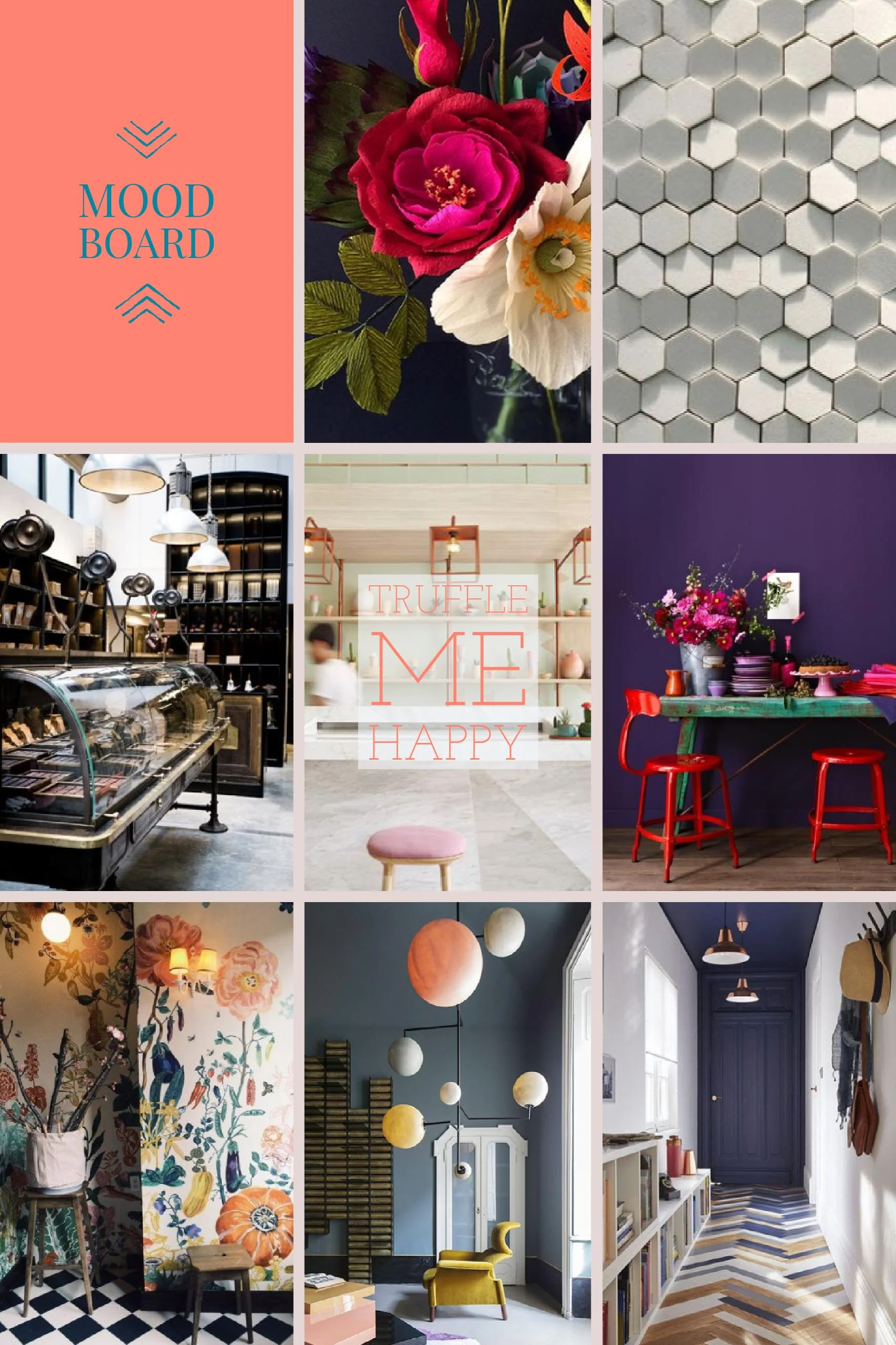
Mood Board | Truffle Me Happy Chocolate Shop
Of the many dreams I dream, I think often of the chocolate shop. About 4 years ago, I became passionately involved with chocolate in the form of truffles. A dark chocolate sea salt truffle experiment for my sister in law turned into a new love that led to a colorful pinterest board and hours with the double burner. There's an art to it and it's so fun to test different flavors. Bring in some whiskey, peppermint, lavender, peanut butter (arguably, not together) and the confections start to abound.
So my love of chocolate gave way to the dream of creating a truffle chocolate shop and then my love of design gave way to creating the space to feature such humble decadence. I took inspiration from other confection shops and also imagined the kind of environment fitting for enjoying chocolate. A place that was comfortable and cozy, textures and finishes that were collectively calming, but pops of color and vibrant prints to stimulate the senses. The name, pulled from the phrase 'Color Me Happy' suggests bright and bold, with the ultimate goal of creating a space for the joy of sharing and appreciating the edible art of truffles.
This will be the first of many mood boards and as my first, I'll take a moment to explain what exactly a mood board is and its creative benefits.
The Mood Board
What words can't quite capture on their own, an arrangement of images around the vision for a project, is an effective aid. Sometimes the most challenging part about design is communicating ideas, when the scope of knowledge might be disparate between designer and client and/or when a client has difficulty envisioning an idea without concrete examples. Mood boards create that. A great explanation that I found is from Evernote's Creative Series (an awesome organization tool):
"The idea of a mood board is to create an emotional scenario that’s congruent with what your client wants — sort of an ambiance collage. It’s photographs, illustrations, screenshots, color swatches, words, shapes: whatever conveys the feel of your design plan."
As far as Truffle Me Happy, if this were an established project, this mood board would be an introduction to the process. It would be the template to cull, rearrange, add, refer, and re-imagine, until the vision and creation is cohesive and right.
So here's the mood board for this humble chocolate shop in all it's wistful glory.
Truffle Me Happy
Key features: Comfort + Quirky Embellishment
Comfort
A place of community and life; large Bistro style seating dotted with large wing back chairs and tons of cascading greenery. A mix of saturated, complimentary colors offset by softer hued pinks and greens.
quirky embellishment
Hone the influence of the french cafe, Rococo time period, and 1960's Jetsons. You see the quirkiness in the scale, the whim of fun prints and textured materials anchored by strong molding and a rich architectural floor.
The Board
This is round one. One day I hope to create this shop and who knows my design vision may be completely different by then, but the wonderful thing about creativity is that the passion remains throughout every alteration in form and identity. Steps into a beautiful creation, a beautiful creation in every step.
For more inspiration you can check out my Pinterest board and to find the links to the original sources. I swear Pinterest saved my sanity in school (possibly distracted it too), as it's a great tool to gather ideas and source items. If you have a design idea in mind, whether it's interiors, graphics, branding, etc, I encourage you to explore the mood board. It is an awesome way to get, and keep, the creative flow goin'.
Warm wishes,
Kels


